The holiday edition was completed and set sail at the end of the New Year weekend — bringing, hopefully, tranquil seas as we enter 2022. This past year was … intense. There really aren’t that many other ways to describe it. On a global scale, we had: tiktok sea shanties, the Ever Given canal blockage, the backups at the Port of Long Beach, and, apparently, the Gulf of Mexico caught on fire.

I didn’t even realize that last one until getting ready to write this essay. On a personal scale, I watched the Pirates of the Caribbean, and had a brief moment of wondering if my brother had been kidnapped by pirates in the Indian Ocean (outcome: it was a pocket dial, not a ransom call).


We were allowed to travel, then we were advised to reconsider those travel plans. We ended up more or less where we began, except time passed, turbulent and storm-tossed.
So, obviously, this year’s card was always going to be about the sea.
From a technical standpoint, my printing company acquired a digital die cutter a couple of years ago, and I’d been curious about its capabilities. When my brain hears “die cutting”, it immediately throws out “pop-up books.” So I knew early on that there was going to be a pop-up element to the card.


I hadn’t previously used the cut-and-fold accordion book technique for the holiday edition, although I’ll frequently use it for other occasions; I like that it allows a book to be made from a single sheet of paper, and that the numerous mountain and valley folds would accommodate the pop-up elements that I wanted to incorporate.


The structure of the cards references back to a similar approach that I took for the 2006/2007 edition — which was before I posted photos of the process of making the cards; I had only started making them in graduate school, 2003/2004. (There's also a passing resemblance to 2011/2012 "year of fog" in the use of a gradient photo collage with a poem overlay, on an accordion book.) It’s fascinating to look back and see both how I was thinking about structures, and how they’ve developed and matured. (They’ve also gotten a lot more time-intensive and expensive to produce, mail, and create.)

The Poetry Foundation has a marvelous database of contemporary and historic poems; I did some searching along the lines of “journey,” “ocean,” “ship,” and was utterly charmed by a recent translation and compilation of Socrates' “The Sea.” I’ve been in Los Angeles long enough that, even though I only make it to the beach once or maybe twice a year, I have plenty of photos of the changing colors of the water, and I decided to lean into being that person who sends pictures of the beach to friends shoveling snow in colder climates. In 2020, I restored a book of maps (Munstero’s Cosmographiae) from the 1550s, and, at the time, took note of the number of ships and sea monsters that were depicted scattered across the oceans. (In a news article that isn’t about catastrophe, the Smithsonian published a piece this year about the excavation of a ship from this era.)

So, at this point, I had: the text; a collection of photos of the sea; a collection of images of ships and sea monsters; historic maps. I dropped everything into InDesign, and arranged the photos to run chronologically from morning light to late afternoon, and aligned all the horizons. The text, which runs across the skies, had page breaks put in which effectively mirror the shapes of waves — a spread has more lines, then progressively fewer, then increases again. This is subtle, but I wanted a sense of motion in the reading of the text itself. The orientation of the ships, fish, and monsters was shifted around, putting each element in play with the other elements and with the text. As the triangles that separate each section are both hidden and visible, and since this is a book about the sea, I treated them as wave forms, and filled the space with ocean.

Then I had to learn how to incorporate die cutting marks into the file; while I didn’t end up using the digital die cutting machine (it tore the paper when there were sharp turns), I’m glad that I went through the process of learning how to set up the files.


Once the printed pages were in the studio, I could start the process of assembly. The first step was to manually create what the digital die cutting wasn’t able to accomplish; I set up a jig to punch holes at the beginning and end of each outline, since part of a successful pop-up function is that the cuts are as parallel to each other as possible (otherwise the element opens at an angle). Then the outlines were freehand cut around each illustration.
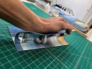

After all of the outlines were cut, the page, still whole, was folded along the mountain folds. When the pages were then folded for the valley folds, the pop-ups were encouraged to fold into the opposite direction from the parent sheet.


After the sheets were folded vertically, the horizontal cuts, separating the pages from each other, followed along the dividing line of the images. At the end of each row, a 45 degree fold and turn were incorporated, to allow the book to both twist and then remain in a single plane. A larger hole was punched at this juncture point, to accommodate the movement.


The books were then folded up into compact 2” squares, and placed in the press to set all the creases.


I was originally going to typeset “best wishes for 2022” in the same font as the text, but “2022” is difficult to typeset: it’s inelegant on the page. I tried several different fonts, then realized that my own handwriting would allow me to adjust the spacing of the numbers more precisely. Even here, I shifted the alignment a bit in Photoshop before having the stamping dies made. The pastedown is foil stamped onto Twinrocker paper, then tabbed onto the last page of the book.


The covers are a gray Twinrocker paper, the ship woodblock illustration on the front stamped with a pewter foil — the exterior of the book is a ship at moonlight, enclosing the progress of the day within.

By this time I was ready to be done with the cards and just wrap them with a paper belt as in previous years, but, well, there’s a point where you’ve done so much work, that there’s no reason not to just keep doing more. Vintage ribbons were used for the foredge ties; however, being vintage, there wasn’t enough of any one color for the full edition, so some are gray and some are blue.
In the spirit of “nature abhors a vacuum,” I was never going to leave the reverse of the card blank. The concept of a map element on the reverse featured in the 2019/2020 cards, although here they are more formally designed. The Cosmographiae had a number of charming maps to choose from; while I was tempted by the new world, I decided the whole world (Typus Orbis Universalis) was a better depiction of current events. The original map was then populated with all of the various ships, islands, and land creatures from throughout the original book’s text and other maps; my darlings were added to Nova Scotia, and I dropped myself in as a sea monster in the Caribbean.


When the text of the book is opened out and flattened from the cover, the map can be read.

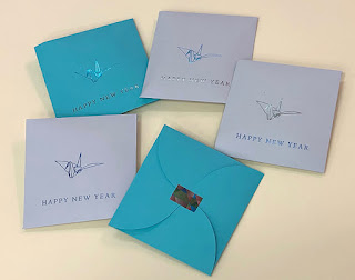
Since at this point I was leaning hard into “why stop now,” the card then received custom envelopes. Going through my various reference books on how-to-fold, the square that opens into a flower matched the emotional feel of the book; it’s larger than the books, to accommodate the thickness, and has a more modern aesthetic — a crisp encapsulation of the more flamboyant interior.


Wishing you the very best in the year ahead: a tranquil harbor, a warm sun, a cool drink.