2019 was a year of whiplash: fantastic opportunities, and the corresponding riptides of life. Earlier this autumn, while listening to Decoder Ring, the following passage from a Sherlock Holmes novel struck home:
“My dear fellow,” said Sherlock Holmes as we sat on either side of the fire in his lodgings at Baker Street, “life is infinitely stranger than anything which the mind of man could invent. We would not dare to conceive the things which are really mere commonplaces of existence. If we could fly out of that window hand in hand, hover over this great city, gently remove the roofs, and peep in at the queer things which are going on, the strange coincidences, the plannings, the cross-purposes, the wonderful chains of events, working through generations, and leading to the most outré results, it would make all fiction with its conventionalities and foreseen conclusions most stale and unprofitable.”
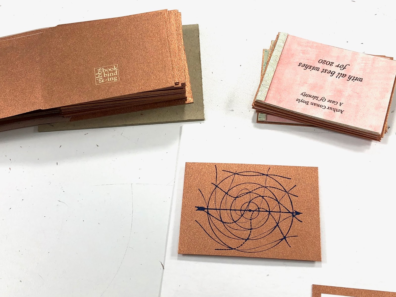
The book is Arthur Conan Doyle's A Case of Identity; while listening to You're Dead to Me, I discovered that Sherlock Holmes was a part of the Victorian publishing Christmas rush. In fact, further research revealed that “Beeton’s Christmas Annual” published the first Sherlock Holmes story, A Study in Scarlet.
I had a collection of USGS Survey Maps of Southern California that had been CalArts library discards, and, after several years, they were finally flattened from their rolled storage state. I wanted to print the text as an accordion book on one side, and have the reader flying over the skyline on the other side, like Peter Pan and the children fly over the skies of London.


I knew that I wanted the covers to pick up on the colors of the USGS maps, and Hiromi Paper has a metallic range that is exactly the color of the landscape markings. And I wanted to bring a sense of the fantastic to the text, through a pastepaper pattern.

The acrylics were supposed to be burnt orange, to go with the warm copper tones of the covers and maps, but, due to the actual pigment color of the paint and the vast quantity of iridescent medium that I added, the color could more accurately be called "the blood of fairies."


There was absolutely no consistency of pigment from print to print; some were gentle washes, and some were much more strongly colored. If this had been any other type of edition, I would have overpainted the gentle washes so that all the books were the same, but these are holiday cards, and the differences are part of their charm.


Then the two parts of the accordion were glued together, with the overlap on the face of the page, rather than as an interruption of the skyline.


"The differences are part of the charm" is the same refrain that I repeated when I realized that my cover structure, where the turn-in forms the pastedown, would require more paper than I had actually purchased, so I ended up incorporating some silver paper from the same line that I had in the studio as the covers for some of the books.


As a result of the number of pages in each book, they can be displayed as stars, not merely as a traditional accordion, a happy accident.


